01
Simple
- Clarity over noiseHide raw data travelers don’t need.
- Easy comparisonMake rooms simple to compare side by side.
I defined a vision for how travelers choose a room on Expedia, with a design strategy and a step-by-step plan to deliver it alongside a cross-functional team.
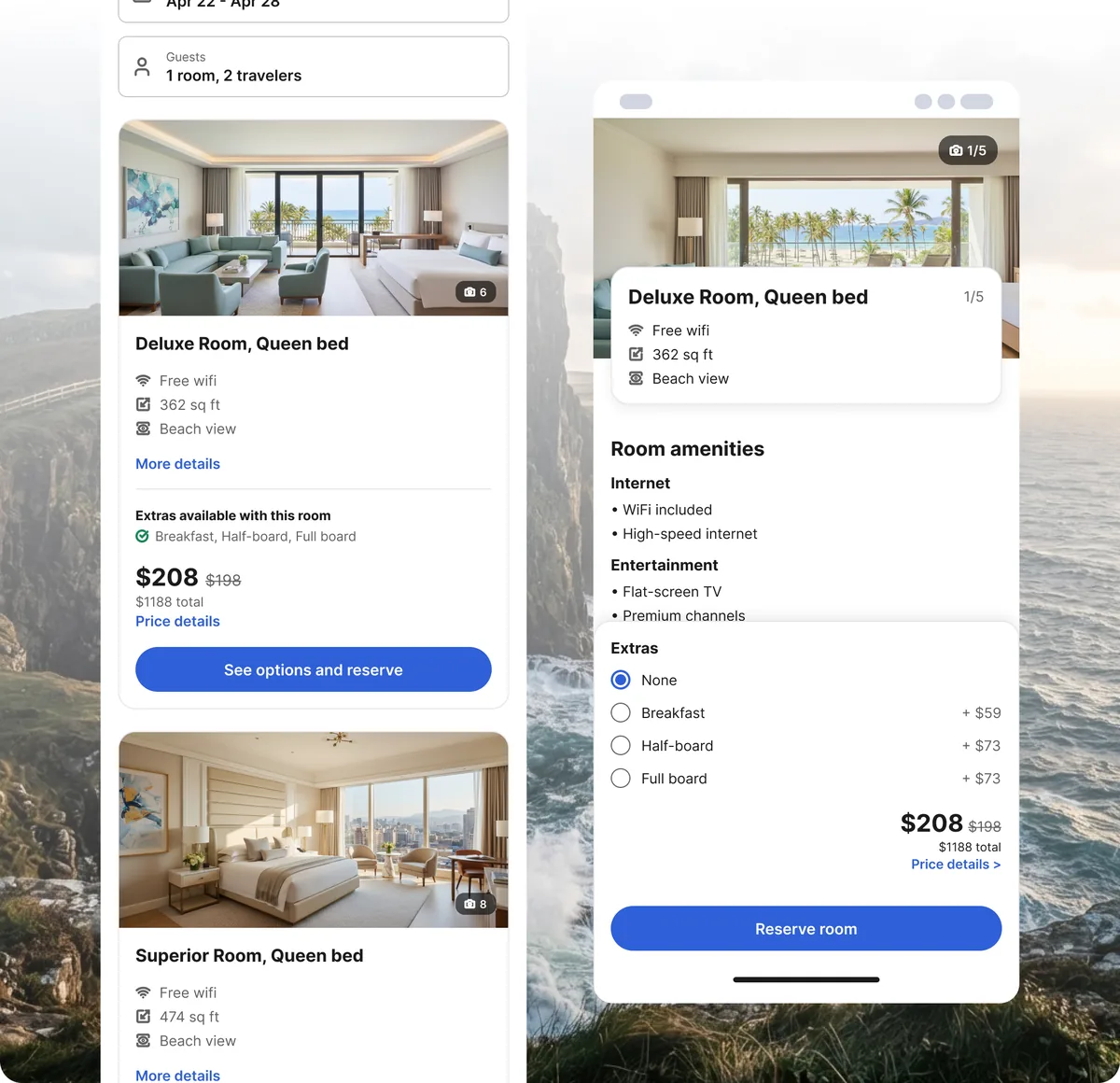
“Help travelers understand, compare and book the right room for their needs, based on what they value, at scale.”
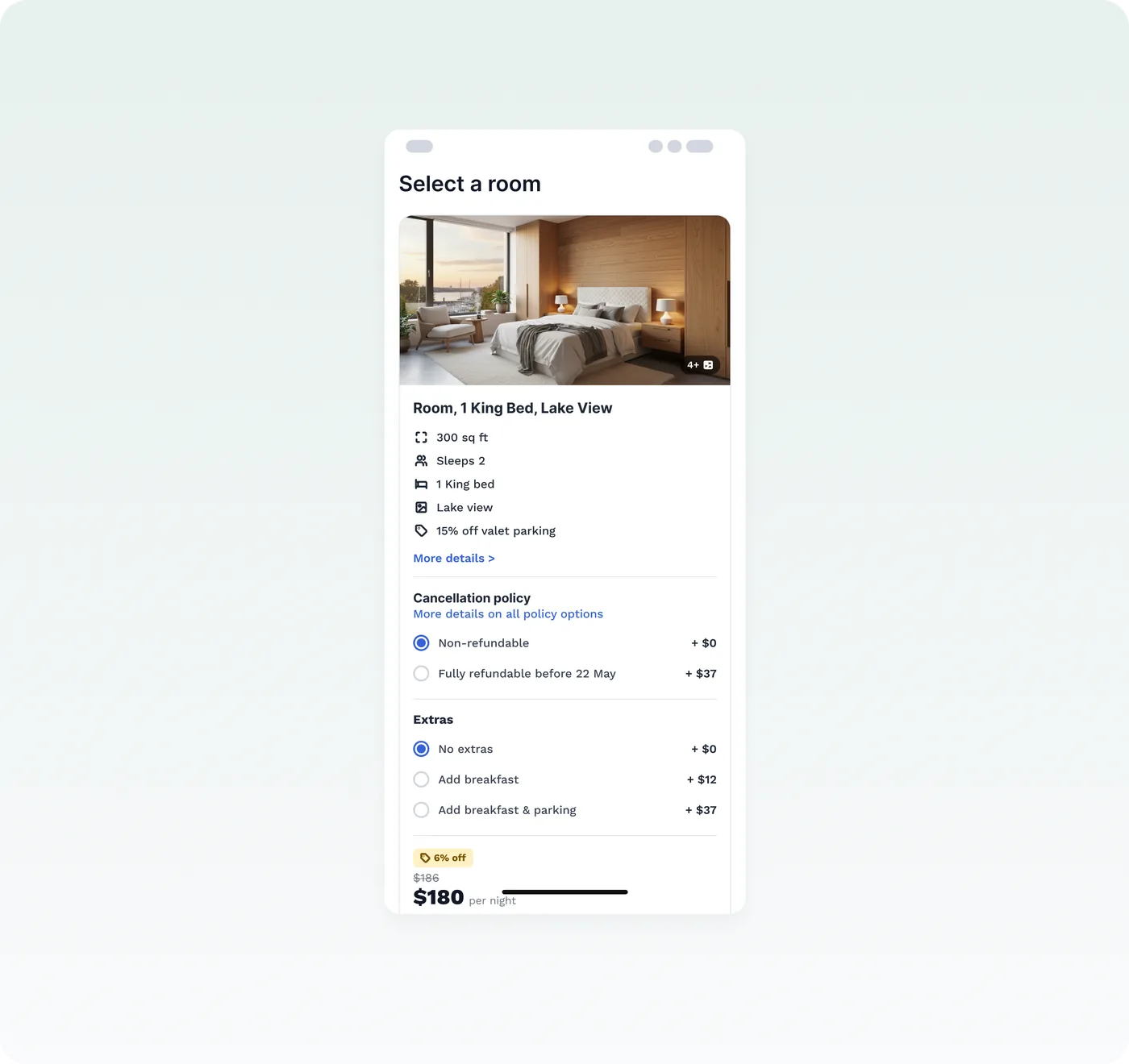
The images seem to be the same, how do you differentiate the rooms?
…what are the times for breakfast? Because if it ends earlier than I usually get up, I am not sure it’s worth it
Actually that is a great deal for parking. I didn’t even consider it before…
35% of travelers booked the cheapest room, so properties missed out on upgrades.
24% of travelers never scrolled past the first 3 rooms.
Getting more for less: quality and trust weighed against price. It’s personal, and it changes with every trip.
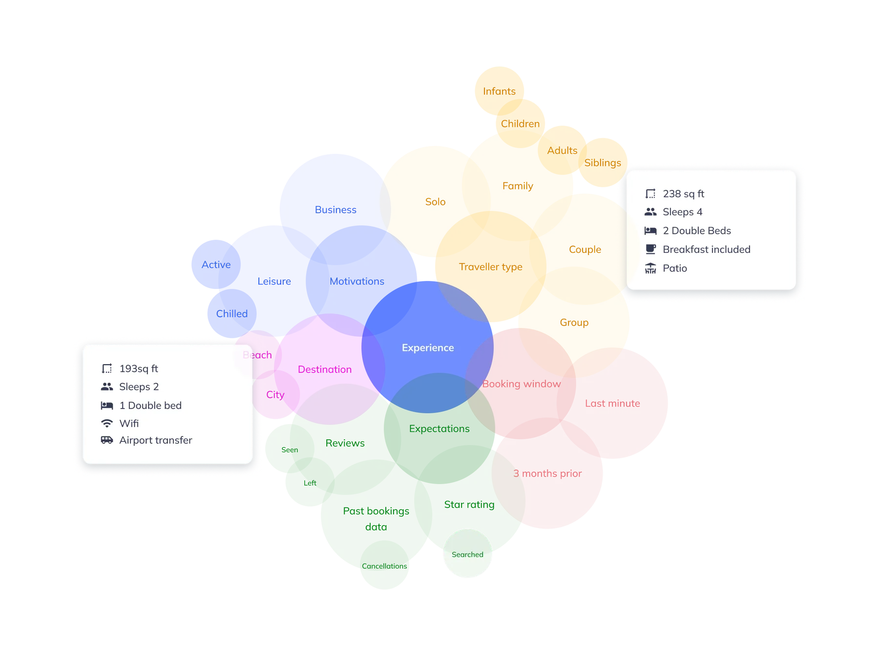
I used this chart throughout the project to show stakeholders why one room card can’t suit every traveler.
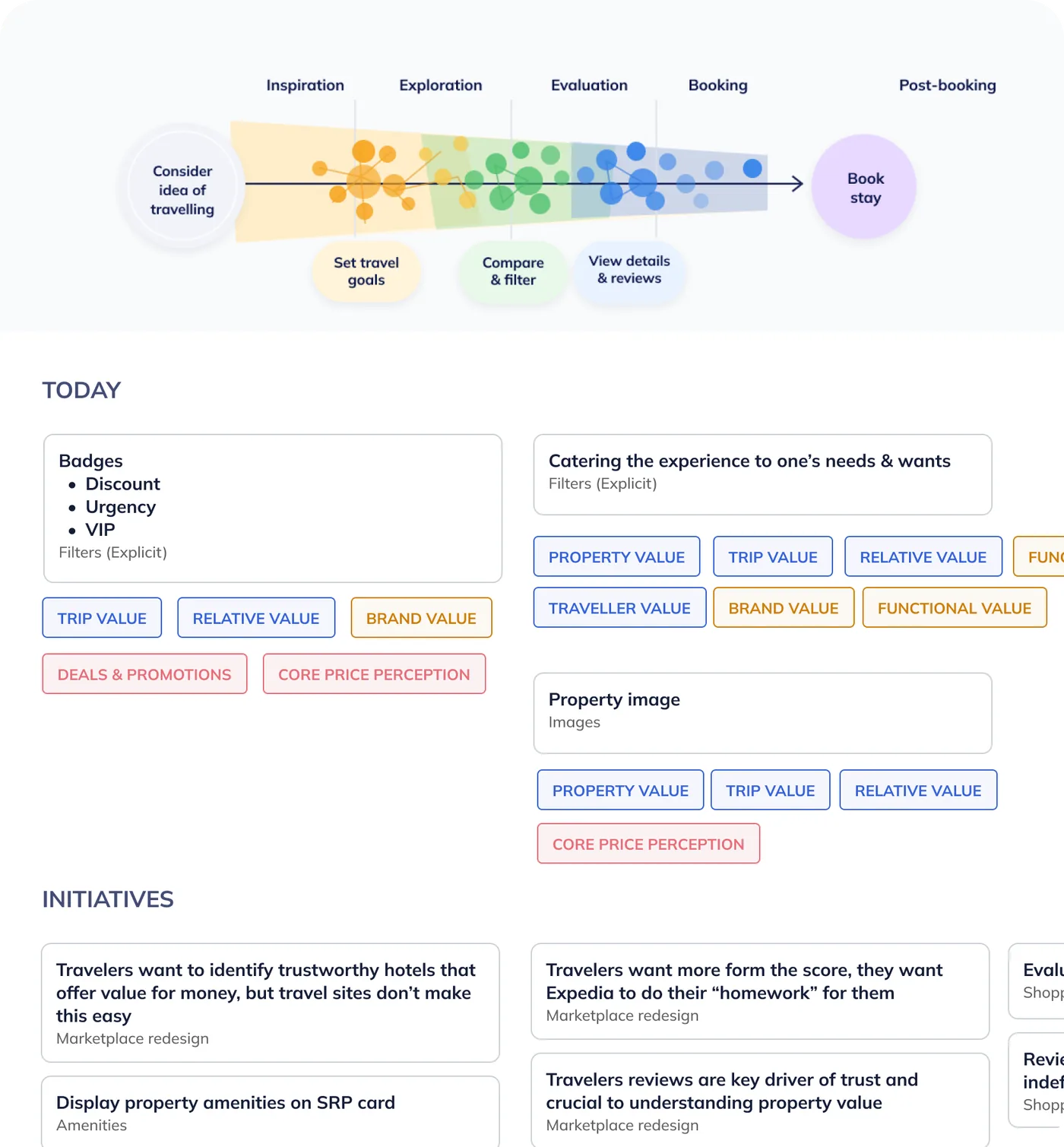
I audited how Expedia communicated a room’s value, from inspiration to after booking, and mapped every touchpoint on one journey.
With the product team, I then mapped the teams and projects already working on value. It showed us where we could have the most impact, and kept us aligned with the teams around us.
Four principles guided every decision, before, during and after booking.
01
02
03
04
We ran a week of ideation with design and business partners across brands, then narrowed 50+ ideas down to 6 priorities.
I presented a prioritisation matrix to stakeholders, weighing traveler value against engineering effort, and we sense-checked it in sprint planning and user testing.
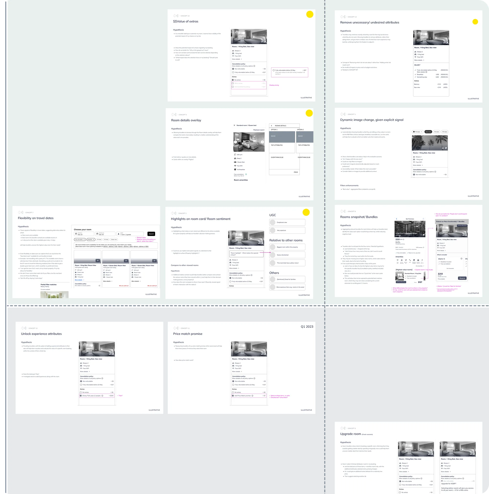
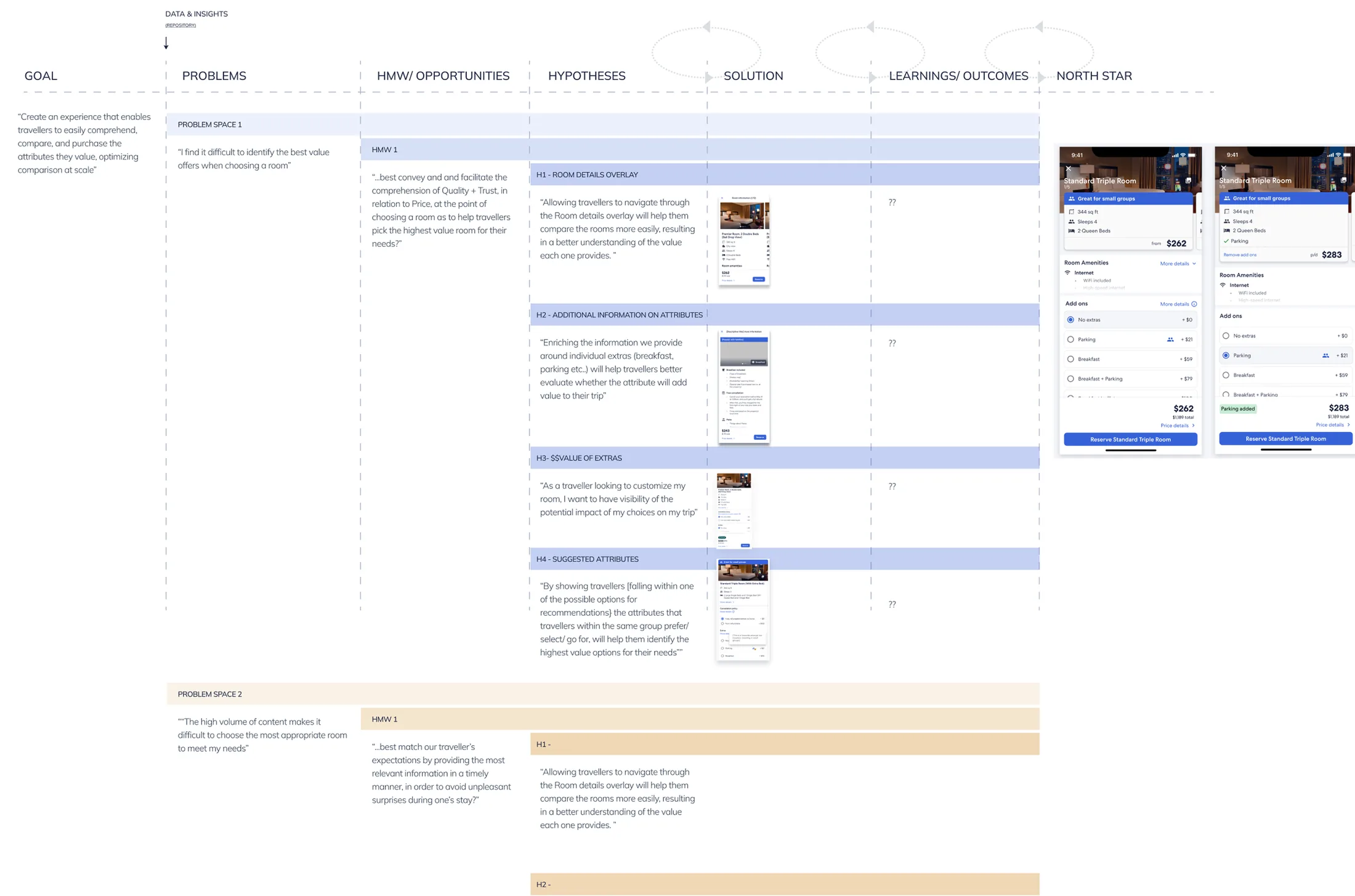
One board connected each traveler problem to our hypotheses, the solutions we tested and what we learned. It became the basis for the team’s roadmap towards our north star.
I turned the strategy into a future-state proposal stakeholders could click through, so the goals were easy to demo across teams.
More compact room cards that reveal extras step by step, so travelers make one decision at a time on mobile.
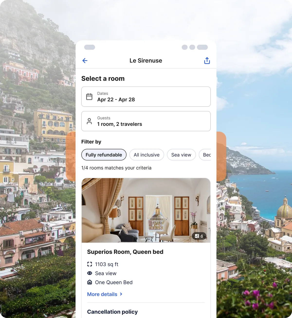
Filters chosen at search carry through to the room list, so travelers see the rooms that fit their needs first.
Showing the amenities every room has once, instead of on each card, so the differences between rooms stand out.
Tailoring room information to each traveler, so they can judge what a room is worth to them.
With engineering, I planned a phased rollout: ship the smallest useful version, check the numbers, then scale globally.
There’s no single best room. Showing the right details to each traveler mattered more than showing more of them.
Knowing who else was working on value stopped us duplicating effort and turned other teams into allies.
Splitting the vision into testable pieces delivered results while the bigger picture was still being built.